Components

Card

Container that groups related content and actions.

Santiago Illi
Engineering
<Box maxWidth="240px">
<Card>
<Flex gap="3" align="center">
<Avatar size="3" src="https://images.unsplash.com/photo-1607346256330-dee7af15f7c5?&w=64&h=64&dpr=2&q=70&crop=focalpoint&fp-x=0.67&fp-y=0.5&fp-z=1.4&fit=crop" radius="full" fallback="T" />
<Box>
<Text as="div" size="2" weight="medium">
Santiago Illi
</Text>
<Text as="div" size="2" color="neutral">
Engineering
</Text>
</Box>
</Flex>
</Card>
</Box>

API Reference

This component is based on the div element and supports common margin props.

PropTypeDefault
asChild
boolean
No default value
size
Responsive<"1" | "2" | "3" | "4" | "5">
"1"
variant
"surface" | "classic" | "ghost"
"surface"

Examples

As another element

Use the asChild prop to render the card as a link or a button. This prop adds styles for the interactive states, like hover and focus.

<Box maxWidth="350px">
<Card asChild>
<a href="#">
<Text as="div" size="2" weight="medium">
Quick start
</Text>
<Text as="div" color="neutral" size="2">
Start building your next project in minutes
</Text>
</a>
</Card>
</Box>

Size

Use the size prop to control the size. Currently, we recommend using only sizes 1 and 2 following the ScaleUI Radix design system.

Santiago Illi
Engineering
Santiago Illi
Engineering
<Flex gap="3" direction="column">
<Box width="350px">
<Card size="1">
<Flex gap="3" align="center">
<Avatar size="3" radius="full" fallback="T" color="accent" />
<Box>
<Text as="div" size="2" weight="medium">
Santiago Illi
</Text>
<Text as="div" size="2" color="neutral">
Engineering
</Text>
</Box>
</Flex>
</Card>
</Box>
<Box width="400px">
<Card size="2">
<Flex gap="4" align="center">
<Avatar size="4" radius="full" fallback="T" color="accent" />
<Box>
<Text as="div" weight="medium">
Santiago Illi
</Text>
<Text as="div" color="neutral">
Engineering
</Text>
</Box>
</Flex>
</Card>
</Box>
</Flex>

Variant

Use the variant prop to control the visual style. Currently, we recommend using only the surface variant following the ScaleUI Radix design system.

Quick start
Start building your next project in minutes
<Flex direction="column" gap="3" maxWidth="350px">
<Card variant="surface">
<Text as="div" size="2" weight="medium">
Quick start
</Text>
<Text as="div" color="neutral" size="2">
Start building your next project in minutes
</Text>
</Card>
</Flex>

With inset content

Use the Inset component to align content flush with the sides of the card.
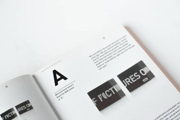
Bold typography

Typography is the art and technique of arranging type to make written language legible, readable and appealing when displayed.

<Box maxWidth="240px">
<Card size="2">
<Inset clip="padding-box" side="top" pb="current">
<img src="https://images.unsplash.com/photo-1617050318658-a9a3175e34cb?ixlib=rb-4.0.3&ixid=M3wxMjA3fDB8MHxwaG90by1wYWdlfHx8fGVufDB8fHx8fA%3D%3D&auto=format&fit=crop&w=600&q=80" alt="Bold typography" style={{ display: 'block', objectFit: 'cover', width: '100%', height: 140, backgroundColor: 'var(--gray-5)', }} />
</Inset>
<Text as="p" size="3">
<Strong>Typography</Strong> is the art and technique of arranging type to make written
language legible, readable and appealing when displayed.
</Text>
</Card>
</Box>
PreviousCallout